[ Article ]
Back to blogDesigning a website for a small business —lessons from product design.

TL;DR: Designing a website for a small business starts with intention. Drawing from product design and user experience principles, this article explains how to start with a clear understanding of the business and its customers, extract useful insights from data, and translate those insights into intuitive UI, persuasive content, effective SEO, and a website that supports long-term business growth.


Key considerations when designing a small business website.
It’s tempting to jump right in and start the process of designing a website for a small business — shop around for what feels like the best option, even jump on the page builder bandwagon, or follow what your competitors are doing. After all, you want your website up and running yesterday. But here’s the catch: if you haven’t taken the time to really understand your business, your customers, and your goals, all that rushing can backfire. You might end up with a website that’s live, but confusing for visitors, hard to maintain(we'll get to that in another article), or failing to bring in leads. Planning first isn’t just a step — it’s the foundation for a site that actually supports growth and delivers results.
Know your business.
Your website should clearly communicate the problem your business solves for customers, front and center, and highlight what helps you differentiate yourself in the market. If I asked you to describe your business, you should be able to explain it clearly and compellingly — the challenges you address and the value you deliver.
What problem do you solve for your customers?
Your customers are at the heart of your website, and if the design doesn’t genuinely serve their needs, it won’t turn visitors into enquiries or sales. To design effectively, you need a clear picture of who they are and what they expect from your site.
Start by asking yourself:
- What are they trying to achieve when they land on your business website?
- Are they looking for quick information, comparing services, booking an appointment, or making a purchase?
- What concerns, questions, or barriers might they have?
- And more importantly, how can your content, layout, and structure address those concerns quickly and confidently?
Creating customer personas—based on real customer insights, behaviour, and website analytics—helps you shape your content, navigation, and calls-to-action. This ensures your website feels intuitive, purposeful, and tailored to the people who matter most.
Conduct feedback sessions with real customers, run moderated usability tests and have set goals (especially if you already have a website and performance is lacking), and dig into your analytics to identify where users drop off or get stuck. Look for bottlenecks, confusion points, and moments where the experience breaks down. These insights give you a clear view of what needs to change and help you make decisions based on evidence, not guesswork.
Define your goals.
Once you understand your customers, the next step is to define what you want your small business website to achieve. A website without clear goals quickly becomes cluttered, unfocused, and ineffective. Thinking like a product designer means being intentional: every component, page, feature, and piece of content should exist for a reason.
Start by clarifying your primary objectives:
- Q: Are you trying to generate leads?
- A: Then your business website needs prominent calls-to-action, simple contact forms, and trust-building content
- Q: Do you want to drive online sales?
- A: Then prioritise seamless navigation, clear product information, and a smooth checkout experience.
- Q: Are you aiming to build credibility?
- A: Then focus on testimonials, case studies, and clear messaging about your expertise.
- Q: Is the goal to reduce admin or streamline bookings?
- A: Then integrate scheduling tools and make actions easy and accessible.
Each goal influences the structure of your website. A lead-driven site looks different from an e-commerce site; a service-based business has different needs from a creative portfolio.
Defining success: Metrics that guide better design.
A key part of product-focused design is setting measurable performance indicators. Decide how you’ll track success:
- Conversion metrics: form submissions, quote requests, bookings, or purchases.
- Engagement metrics: time on page, scroll depth, click-through rates, and interaction with key elements.
- Acquisition metrics: which channels drive the most valuable visitors — search, social, email, or referrals.
- Behavioral indicators: where users drop off, what they ignore, and which paths lead to the strongest outcomes.
These metrics turn your website from a static “online brochure” into a living product you can refine and improve. Once your goals and success measures are clear, every design decision — from layout to copy to functionality — becomes more purposeful. Instead of guessing what might work, you’re designing with clarity, intent, and a way to validate your choices.
Of course, all of this assumes you already have a live website — and many small businesses don’t. But you can still gather meaningful insights before anything is built. For example:
- Ask your existing customers what information they looked for first, what convinced them to choose you, and what nearly stopped them.
- Review conversations, emails, and messages to identify common questions, misunderstandings, or recurring objections.
- Analyse competitors’ websites to spot patterns in content, messaging, and structure — and where customers might still be underserved.
- Run simple surveys on social media or via your mailing list to understand what people expect from a business like yours.
Structure your website around user journeys.
Once you understand your customers and define your goals, the next step is to map out how those two things connect. This means thinking in terms of user journeys — the paths visitors take to achieve something, from the moment they land on your website to the moment they convert.
Product designers use journey mapping to make sure every step is intentional, frictionless, and supported by the correct information. Your business website should do exactly the same.
To identify the key journeys your visitors take, start by defining the most important actions users come to your site to complete. These usually fall into a few categories:
- Learn — understanding who you are and what the business does
- Evaluate — comparing services, checking prices, reading reviews
- Decide — making contact, booking, purchasing, or requesting a quote
- Return — coming back for updates, support, or repeat purchases
Every business will have its own variations, but most small-business websites follow a similar pattern:
- Awareness
- Trust
- Understanding
- Action
Mapping these steps helps you see what content you need — and where you need it. Plan your site structure around these journeys. Your site architecture should make the most important tasks the easiest to do. Ask yourself:
- Can users instantly understand what the business offers?
- Can they find your services, pricing, and contact information without digging?
- Are there clear next steps at every stage?
- Does every page support a purpose, or are there distractions that dilute focus?
- Does the homepage that clearly states the problem you solve?
- Is the services (or products) section that’s easy to navigate?
- Do you have a pricing or “how it works” page?
- Is there social proof — testimonials, case studies, reviews?
- Is there a contact or booking page that removes friction?
- Do you have supporting content such as FAQs, About, or Blog (only if it serves the customer)?
Design for clarity, not clutter. A common mistake small businesses make is trying to say everything at once. But when everything is important, nothing is.
Design principles and cognitive laws.
Product design principles remind us to reduce cognitive load, and we can draw on established laws from cognitive psychology, usability, and human-computer interaction to guide our decisions. Here are some of the most relevant rules, along with practical ways to apply them to small business websites:
Hick’s Law:
- The time it takes to make a decision increases with the number and complexity of choices.
- Application: Keep navigation simple and predictable. Avoid overwhelming users with too many options at once, and present clear pathways to key actions.
Fitts’s Law:
- The time to reach a target depends on the distance to and size of the target.
- Application: Make actions obvious with clearly visible buttons and calls-to-action. Larger, well-placed buttons are easier to click or tap, especially on mobile.
Miller’s Law:
- People can hold roughly 7 ± 2 items in working memory at once.
- Application: Avoid unnecessary pages, duplicate content, or excessive information. Present content in digestible chunks to reduce cognitive load.
Gestalt Principles (proximity, similarity, continuity, closure):
- Humans naturally perceive visual elements as groups or patterns.
- Application: Use clear headings and consistent layout to guide the eye. Group related items logically and visually to make scanning intuitive.
Jakob’s Law:
- Users spend most of their time on other sites, so they expect your site to work similarly.
- Application: Keep navigation predictable and consistent with common patterns users are familiar with to reduce cognitive friction.
Serial Position Effect:
- Users are more likely to remember the first and last items in a list.
- Application: Prioritise the most important information at the top or bottom of pages to make it immediately noticeable.
Law of Prägnanz (Simplicity):
- People tend to interpret ambiguous or complex images in the simplest form possible.
- Application: Reduce clutter and unnecessary design elements. Keep layouts clean so users can focus on key actions.
As a rule, if a user has to think too hard about what to click next, your site’s structure isn’t working — which is why testing early and often is crucial. You don’t need a full website to validate your structure. Product teams test concepts from the very beginning, and you can do the same, even with something as simple as sketching your ideas on paper. Show your structure to someone unfamiliar with your business and ask where they would click first, or use your existing customers to validate the flow by asking, “Would you know what to do next?” A well-designed structure feels intuitive and obvious, even on a user’s very first visit.
Content and messaging: Let the words lead the design.
Once your user journeys are mapped and your site structure is clear, the next step is content. In product design, content always comes first — visuals exist to support your message, not the other way around. For small businesses, this principle is critical: a beautifully designed page won’t convert if the message isn’t clear or relevant to your audience. The first message should tell prospective customers exactly what your product offering is.
A great example is Apple thanks to their human interface guidelines. Whilst their product website features striking visuals and sleek animations, every element is carefully crafted with intention. Apple approaches content like master wordsmiths: headlines, product copy, and calls-to-action are concise, clear, and emotionally resonant, designed to guide users, highlight benefits, and subtly evoke desire. The visuals aren’t just decoration — they reinforce the message, draw attention to key points, and enhance the overall experience. Every design choice serves the content, creating a site that communicates effectively while engaging the user’s emotions.
Why content matters more than style.
Your content communicates your value, guides users along their journey, and answers the questions or objections they have. Before you pick colours, fonts, or images, you can reference questions from the above section. Having clarity on these points ensures every word, heading, and call-to-action is purposeful.
Prioritise clarity and relevance.
Small businesses often feel pressure to include everything: every service, every feature, every accolade. But when everything is important, nothing stands out. Product design teaches us to reduce cognitive load by:
- Using concise, scannable copy
- Highlighting benefits over features
- Structuring content according to the user journey
- Guiding attention to the next step with clear calls-to-action
Draft before you design.
You don’t need a final polished copy to start — even rough drafts or bullet points work. The goal is to test messaging, flow, and clarity before visuals are applied. Once the content is solid, the design becomes a tool to enhance it: layout supports hierarchy, colour reinforces clarity, and typography guides reading flow.
Test and iterate early.
Just as you structure your content thoughtfully, testing it early ensures your message is clear and actionable. Ask your audience simple, targeted questions like:
- “What would you do next?”
- “Do you understand what we offer?”
Refine based on feedback before investing in design. By prioritising content first, you ensure that your website isn’t just visually appealing, but also effective at communicating your value and driving action.
Visual design: Make your website clear, usable, and trustworthy.
Once your content and user journeys are defined, the next step is design. In product design, visuals aren’t just decoration — they exist to support the message, guide attention, and make actions obvious. For small business websites, thoughtful design ensures users understand what you offer and feel confident interacting with your site.
No matter the size of the business or its turnover, having a solid design system in place is essential. A clear set of visual rules — from typography and color to buttons and layouts — creates consistency, builds trust, and makes your brand feel professional and reliable. A design system isn’t a luxury reserved for large companies; it’s a foundation that helps small businesses scale, stay cohesive across platforms, and present themselves with clarity and confidence.
Typography: Fonts, typefaces, and readability.
When thinking about typography, it helps to understand the difference between a typeface and a font. A typeface is the design of the letters — for example, Helvetica or Inter — while a font is a specific implementation of that typeface, such as Helvetica Bold 16pt. In simple terms, the typeface is the family, and the font is the style and size you use.
Readability and hierarchy across devices.
Choose fonts that are readable across devices and sizes, and establish a clear hierarchy with headings, subheadings, and body text so users can quickly distinguish between sections. Consistent typography communicates professionalism and reinforces your brand identity. Many small business websites default to sans-serif fonts, and for good reason: they are clean, modern, and highly legible on screens of all sizes. Serif fonts can work for headings or stylistic touches, but at smaller sizes or on certain devices, their fine strokes may blur or render inconsistently, potentially reducing readability.
To ensure performance and consistency, rely on trusted sources like Google Fonts, or professional font foundries. Fonts from these providers are optimised for web use, ensuring crisp rendering across browsers and devices without slowing down your site. Combined with good hierarchy, spacing, and contrast, typography becomes a powerful tool to guide users, communicate your brand, and make your website feel professional and trustworthy.
The Google Fonts "SEO myth".
Some SEO experts warn that using Google Fonts will slow down your website and hurt performance — even claiming it could cost you thousands in lost revenue. You know the type: a single person who’s a designer, developer, and marketing expert all at once, charging hundreds per month just to change text in a WordPress template. It’s kind of funny — and then, of course, there’s a plugin they’ll recommend to "fix" the problem. In reality, there’s no evidence to support these claims. Modern tools make using Google Fonts fast, reliable, and perfectly safe for small business websites — or any website, for that matter.
Layout & spacing.
A clean, well-structured layout reduces cognitive load and guides users naturally through their journey. White space isn’t wasted space — it separates content, highlights important elements, and makes pages easier to scan. Crowded pages or inconsistent spacing can overwhelm visitors, making it harder for them to understand your offerings or find what they need.
Use consistent grids and spacing to create rhythm and predictability. When margins, padding, and alignment are uniform, users subconsciously understand where to look next, making navigation feel effortless. Group related items together visually, and separate different sections clearly — this helps users quickly identify key areas like services, pricing, or calls-to-action.
Product designers often rely on common UI patterns to guide layout decisions. For example:
- F-pattern or Z-pattern scanning: Users naturally scan pages in these patterns, so placing key information along these lines improves visibility.
- Card layouts: Group related items like services, products, or testimonials in visually distinct “cards” for easy comparison.
- Consistent headers and navigation bars: Keep menus predictable so users always know where to find core content.
Think of spacing as a tool to prioritize information. Important elements like headlines, buttons, or forms should stand out, while supporting content remains readable but unobtrusive. Proper layout and spacing also make your site feel more professional and trustworthy — small details like alignment, consistent padding, and breathing room around content convey care and attention to quality.
Finally, remember that less is often more. Avoid cluttering pages with too many elements, ads, or decorative graphics. Each section should have a purpose, and spacing helps communicate that purpose without overwhelming the visitor. A website with thoughtful layout, spacing, and familiar product design patterns isn’t just aesthetically pleasing — it guides users seamlessly through their journey, reduces confusion, and increases the likelihood of conversion.
Colour & contrast: Guide attention and build trust.
Colour is more than just aesthetics—it communicates your brand personality, highlights key actions, and improves readability. In product design, every colour choice is intentional, helping users understand hierarchy and guiding them through their journey.
A designer should always aim to meet at least WCAG AA accessibility standards, ensuring essentials like readable text, sufficient colour contrast, and keyboard navigation are in place. For government, educational, or public service websites, designers should target WCAG AAA, the highest level, to make the site accessible to as many users as possible. Meeting these standards not only improves usability for everyone but also demonstrates professionalism and inclusivity.
For small business websites, a few fundamental principles—including simplicity, clarity, and a focus on the user experience—apply:
- Support readability: Ensure sufficient contrast between text and background so your content is easy to read on any device. Tools like the WebAIM contrast checker can help you meet accessibility standards.
- Highlight key actions: Use accent colours sparingly to draw attention to calls-to-action, buttons, or important links. Consistent use of colour signals what’s clickable and guides users without overwhelming them.
- Maintain consistency: Limit your palette to a small set of colours that reflect your brand. Too many colours can feel chaotic and reduce trust.
- Evoking emotion: Colours carry psychological weight — warm tones can feel friendly and energetic, while cooler tones can communicate professionalism and reliability. Choose colours that reinforce the feeling you want your brand to convey.
Good colour choices work hand-in-hand with typography and layout, creating a hierarchy that makes your website intuitive and easy to navigate. When contrast, consistency, and purpose are applied thoughtfully, your design not only looks professional but also builds confidence and reduces friction for your users.
Consistency & visual cues.
Consistency in design is one of the simplest yet most powerful ways to improve usability. When buttons, icons, images, and interactive elements behave in predictable ways, users instinctively know how to interact with your site. Inconsistent styles or unexpected behaviors, on the other hand, create confusion and friction, making it harder for visitors to complete tasks.
Visual cues guide users through your website, subtly showing them where to click, what to focus on, and what actions are possible. These cues can include:
- Arrows or indicators that show the direction of navigation or highlight next steps.
- Hover states, shadows, or color changes that signal clickable buttons or interactive areas.
- Micro-interactions — small animations or feedback when an action is taken — that reassure users their input has been registered.
Applying these principles consistently across your site ensures that users don’t have to think twice about how to interact with your content. Predictable patterns reduce cognitive load and make the experience feel seamless, especially for first-time visitors.
By focusing on layout, typography, colour, spacing, and consistent visual cues, your design reinforces the user journeys you’ve already mapped. Every element serves a purpose — highlighting content, guiding actions, or communicating hierarchy — so your website feels professional, intuitive, and trustworthy, all without overwhelming your visitors or sacrificing clarity.
Imagery & iconography.
Images and icons aren’t just decoration — they’re powerful tools for communicating your message, guiding users, and reinforcing your brand. Every visual element on your website should serve a purpose, whether it’s to illustrate a concept, highlight a benefit, or direct attention to an action. Random or irrelevant visuals can confuse users and dilute your message, so intentionality is key.
Photography:
- Choose images that feel authentic and relevant to your business. Avoid generic stock photography that doesn’t reflect your brand or audience.
- Consider your audience’s perspective: the images should help them understand your products, services, or values.
- Maintain a consistent style or tone — whether that’s warm and friendly, professional and polished, or playful and bold — so the site feels cohesive.
Illustrations & icons.
Icons and illustrations are powerful tools to make information scannable and guide users toward key actions or important sections. For example, a phone icon next to contact details or a shopping cart icon for purchases instantly communicates function without relying on text alone.
Consistency is crucial. Keep icon style uniform across the site — mixing flat, line, 3D, or filled icons can make the design feel chaotic and unprofessional. A coherent style helps users instinctively understand interactive elements and reinforces a sense of order and trust.
Thoughtfully designed illustrations and iconography can also enhance your brand identity and make your website feel unique. A strong example can be seen in Rokitsite’s approach, where every visual element is intentionally sized and positioned within the grid to clearly communicate key selling points. The visuals work seamlessly with the site’s structure, guiding users through content and highlighting important messages — all while keeping the layout clean and approachable. When done this way, imagery and icons don’t just decorate the page; they actively support comprehension, engagement, and conversion.
Grid systems & alignment.
A grid is one of the most fundamental tools in web design, providing an invisible structure that organises content consistently across your website. Think of it as the backbone that ensures every element — text, images, buttons, and icons — aligns harmoniously, creating balance and rhythm on each page.
Grids help users scan pages more easily because predictable alignment and spacing guide the eye naturally. When elements follow a consistent structure, visitors can focus on the content rather than trying to figure out where to look next. This reduces cognitive load, improves comprehension, and enhances the overall user experience.
Alignment also reinforces professionalism and trust. Misaligned text, images, or buttons can feel sloppy and distract from your message, whereas consistent placement signals care and attention to detail.
Grid systems are flexible: they allow for variation within a consistent framework. For example, you can create visually interesting layouts with columns of different widths or staggered content blocks, as long as they respect the underlying grid. This approach balances creativity with clarity, giving your website a polished, cohesive look while supporting the user journeys you’ve defined.
By combining grids with thoughtful spacing, hierarchy, and visual cues, your website achieves a sense of order that makes navigation intuitive and content easier to digest. In short, a well-implemented grid system keeps your design visually consistent, predictable, and user-friendly — all critical for a small business website that wants to look professional without overwhelming visitors.
Hierarchy & emphasis.
Hierarchy is about directing attention — showing users what to look at first, what matters most, and what they can do next. Beyond typography and spacing, hierarchy uses visual weight to guide the eye through a page in a way that feels natural and purposeful. Size, colour, contrast, and positioning all work together to highlight key content or actions without overwhelming the layout.
Your most important elements — headlines, calls-to-action, value propositions — should naturally “pop,” drawing users in even at a quick glance. Supporting content can sit quietly beneath it, offering more detail as users continue down the page. This layered approach mirrors how people scan rather than read, making your site feel intuitive and easy to navigate.
Emphasis doesn’t always mean making something bigger or brighter. Subtle techniques, like giving an element more surrounding white space or placing it at the top-left of a section, can create a stronger draw than colour alone. The goal is balance: guide attention deliberately, but avoid shouting. When everything competes to be noticed, nothing stands out.
Strong hierarchy creates momentum. It pulls people through your content, clarifies your message, and makes it obvious where to go next. For small businesses, this often means making sure your value proposition, service options, and main call-to-action are unmistakable — not lost in clutter or pushed below secondary details. When hierarchy is done well, your website feels effortless to browse because users instinctively understand what matters most.
Micro-interactions & feedback.
Micro-interactions are the small, often unnoticed moments of movement or response that make a website feel polished, trustworthy, and alive. These include hover effects on buttons, subtle animations when elements appear, form fields that validate as you type, or a simple colour change when an action is completed. While they may seem minor, they play a powerful role in shaping how users experience your website.
At their core, micro-interactions provide feedback — they confirm that something has happened. When a button darkens on hover, it tells users, “Yes, this is clickable.” When a form field shows a green check mark, it reassures them that they’re doing things correctly. When an error message appears at the right moment, it helps them recover quickly instead of becoming frustrated.
In product design, these moments reduce cognitive friction, guide behaviour, and increase confidence. For small business websites, they create a sense of quality and care — the feeling that the experience has been crafted, not thrown together. Even micro-animations like a smooth fade-in or a sliding panel can help direct attention and make interactions feel more intuitive.
The key is subtlety. Micro-interactions should never distract, slow down the page, or compete with primary actions. Instead, they should reinforce clarity, support accessibility, and make the interface feel responsive. When done well, users barely notice them consciously — they simply feel that the site is easier, smoother, and more enjoyable to use.
Animation: Use it to support the experience, not steal the show.
Animation can add refinement, personality, and clarity to a small business website — but only when it supports the user’s goals. The best animations are subtle, purposeful, and fast. They help guide attention, reveal information smoothly, and make transitions feel natural. But in small-business web design, animation is often misused. Avoid scroll-jacking (where scrolling is hijacked to force a controlled animation sequence), as it wrestles control from the user and creates frustration.
Steer clear of heavy page-entry animations that delay content or require users to wait for things to “load in.” And while preloaders can have a place in complex web applications, they rarely — if ever — belong on a small business website, where the priority should be immediate access to information. Excessive motion, long transitions, or animations that fire on every scroll can slow down the experience and distract from your message. Good animation should feel almost invisible — enhancing clarity, not competing with it. When used sparingly and intentionally, it brings polish and professionalism; when overused, it becomes noise.
Responsive design principles.
No matter how polished your layout looks in a static design file, a real website must work across a huge range of screen sizes — from small mobile screens to large desktop monitors. Responsive design ensures that your layout, spacing, and hierarchy adapt gracefully, keeping your site readable, usable, and visually consistent wherever it’s viewed. This isn’t just about “shrinking things down.” It’s about rethinking how content reflows as space changes — columns collapsing into a single stream on mobile, imagery scaling with purpose, spacing adjusting to keep the page breathable rather than cramped.
A strong responsive system makes each breakpoint feel intentional, not like a compromise or a patch. This is why Rokitsite uses Tailwind CSS in its workflow. Tailwind is built on a mobile-first philosophy and applies styles from the smallest screens upward. The result is a base experience that’s always optimised for mobile, with enhancements added naturally as screens get larger. Its consistent utility classes help maintain alignment, spacing, and hierarchy across every component and screen size.
Responsive design isn’t a “nice to have” — it’s the expectation. Users won’t adapt to your layout. Your layout must adapt to them.
Design mobile-first.
Mobile-first design is the natural extension of responsive thinking. Instead of designing a full desktop layout and then figuring out how to cram it into a smaller screen, mobile-first forces clarity from the start. Most small businesses see the majority of their traffic coming from mobile devices — often the visitors with the highest intent. That makes the smallest screen the most important, not the exception.
Designing from mobile upward pushes you to prioritise what actually matters, helping surface the most important content and actions first:
- What must the user understand immediately?
- What is the primary action they should take?
- What elements are essential — and what’s just decorative noise?
Working within tight constraints early produces cleaner hierarchy, simpler navigation, and more focussed content. Then, as you scale up to tablet and desktop, the design expands naturally instead of swelling with clutter. Even your desktop layout becomes clearer and more structured because it was built on strong foundations.
Mobile-first doesn’t mean ignoring the desktop layout. It means designing for content first, constraints second, and expansion last. The payoff is a website that feels fast, effortless, and intentional across every device — not a desktop layout awkwardly crammed into a smaller box.
Accessibility.
Accessibility isn’t just about meeting standards — it’s about ensuring that everyone can use your website regardless of their abilities, devices, or environment. An accessible site is clearer, easier to navigate, and more inclusive, which ultimately benefits all users, not only those with disabilities. It also improves SEO, reduces friction, and builds trust by showing that your business cares about real people.
Effective accessibility starts with fundamentals: proper colour contrast so text is always readable, structured headings so pages can be scanned by both humans and screen readers, and alt text that describes imagery in a meaningful way. Interactive elements like buttons, links, and form fields should be labelled clearly and large enough to tap on mobile. Keyboard navigation is equally important — if a user can’t navigate your site without a mouse, it isn’t fully accessible.
Designers should prioritise accessibility standards early in the process. When accessibility is considered from the first wireframe — rather than treated as an afterthought — it eliminates waste, prevents costly fixes later, and leads to cleaner, more intentional design decisions. Building accessibility in from the start makes the entire project more efficient and ensures the final experience feels seamless and coherent.
Avoid using visuals as the only way to communicate meaning. Icons, colours, and animations should reinforce content, not replace it. Similarly, ensure that motion and animations never interfere with usability; provide subtle, optional interactions that respect users who prefer reduced motion.
Accessibility isn’t a one-time checkbox. It’s a continuous design mindset. When built into the process early and consistently, it leads to better structure, better content, and a more professional, future-proof website. Making your website accessible isn’t just good practice — it’s good business.
SEO starts with information design, not tactics applied after the fact.
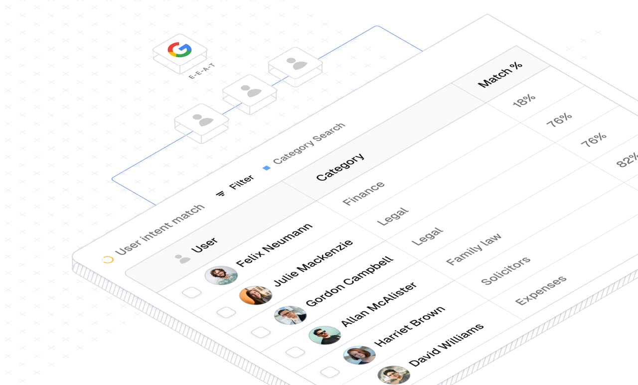
SEO isn’t just something developers handle behind the scenes — design plays a major role in how search engines interpret, understand, and rank your small business website. A well-designed interface doesn’t just look good; it organises information in a way that helps both users and search engines make sense of it.
Everything starts with clear, well-structured content. Logical headings, scannable sections, and a visual hierarchy that mirrors your content hierarchy all help search engines understand what matters most on a page. If a human can skim your layout and instantly grasp the key message, Google usually can too.
Navigation plays a major role as well. Simple, predictable menus and helpful internal links improve the user journey while also making it easier for search engines to crawl your site. If users get lost, search engines do too.
But none of this works without good copywriting. Your content should always satisfy people first and search engines second — and yes, that is absolutely true. Google rewards pages that genuinely answer user questions, keep visitors engaged, and provide value. Over-optimised, keyword-stuffed, or overly clever copy not only feels unnatural but can harm your rankings. Clear, concise, helpful writing will always perform better than text written purely for algorithms. And just adding a few meta tags and calling it “SEO” won’t cut it — sorry, agency brochures everywhere.
Good readability is also a design-driven SEO factor. Typography, spacing, contrast, and layout all influence how easily users can consume your content — and user behaviour (scroll depth, time on page, bounce rate) directly ties into SEO. If your content looks tiring or cluttered, people will leave quickly. Search engines notice that.
Visuals matter, too. Images should be sized appropriately, load quickly, and support the content rather than distract from it. Meaningful alt text helps reinforce context and improves accessibility.
Ultimately, SEO-friendly design isn’t about tricks — it’s about reducing friction. The easier your website is to navigate, read, and understand, the better it will perform. A design that prioritises clarity, hierarchy, and genuinely helpful content lays a stronger SEO foundation than any technical optimisation alone.
Designing for speed and perceived performance.
Performance isn’t just about server speed or code optimisation — design choices play a huge role in how fast and smooth your website feels to users. Every visual element, interaction, and layout decision has the potential to affect perceived performance. A cluttered page, oversized hero images, or too many decorative elements can make a site feel slow, even if the underlying code is efficient.
In product design, we often work in swim lanes, with engineers operating in the lane right beside us. If we were to hand over a design that was inefficient, unclear, or unnecessarily complex, it would quickly result in a call asking us to justify those decisions. Design is expected to respect technical constraints and performance considerations from the outset. The same principle applies when working outside large product teams. Even if you’re a small business owner and this is your first time collaborating with a design team, agency, service, or freelancer, it’s important to understand that thoughtful constraints and clear priorities are what enable high-performing design.
Prioritising performance in design starts with simplicity and clarity. Limit the number of elements on each page to what’s truly necessary for the user journey. Use imagery and icons intentionally, compress graphics to reduce file sizes, and avoid unnecessary animations or effects that distract or delay key actions. Thoughtful spacing and a clean layout not only improve readability but also reduce cognitive load, helping users process information faster.
Typography and content choices also influence performance. Choosing legible fonts, optimising line length, and breaking content into digestible sections keeps users engaged and prevents frustration. Even micro-decisions — like using iconography instead of long paragraphs to communicate a feature — can improve perceived speed and efficiency.
A key principle is perceived performance: users don’t always notice milliseconds, but they notice friction. Design can make a website feel fast by guiding attention, prioritising key actions, and keeping interactions snappy and intuitive. A visually focused, streamlined site communicates professionalism and reliability, reinforcing trust while making it easier for users to navigate quickly.
By integrating performance into the design process — rather than leaving it as a development afterthought — small businesses can deliver experiences that feel fast, smooth, and satisfying across every device.
Bringing It all together: Making design choices you can have confidence in.
Web design for small businesses isn’t just about picking colors, fonts, or layouts — it’s about understanding your customers, defining clear goals, and creating an experience that guides visitors effortlessly from curiosity to action. From mapping user journeys and structuring content, to prioritising clarity, accessibility, performance, and responsive design, every decision should serve a purpose. Typography, spacing, imagery, and visual cues all work together to communicate your brand and reinforce the message you want to deliver.
Thinking like a product designer means treating your website as a living product — one that starts with strategy, content, and design, rather than features. By laying these foundations first, you set yourself up for a small business website that is not only beautiful but functional, fast, accessible, and ready to grow with your business.
A thoughtfully designed small business website doesn’t just exist online; it works, performs, and converts — all because you started with the right questions and the right approach from day one.
“Research extensively, plan thoroughly, design intentionally, and test relentlessly” — all before a single line of code is written, and you’ll build a small business website that truly works.
[ Good reads ]
Related articles.
View all the related news and articles from Rokitsite.
Website design costs explained: Why prices vary and what they include.
If you’ve ever searched for website design costs, you’ve probably noticed how widely the prices vary. One provider quotes a few hundred, another quotes several...
 Read articleRead article
Responsive design for real-world use —beyond the feature list.
We’ve all heard of responsive design by now — or at least we should have. It’s often presented as a selling point by web design companies, usually tucked into a...
 Read articleRead article